Race and Place in Partisan Voting
Recent work by Jonathan Rodden and others has pointed to the importance of population density in predicting partisan voting patterns. As seen in this precinct-level map of partisan voting patterns, generated by Ryne Rohla and published by the New York Times, cities are azure islands surrounded by oceans of crimson countryside. In an influential article published on the eve of the 2016 election, Rodden noted that this pattern is not simply the blue cities of the coast; even the small towns of the heartland are blue ink blots on mottled pink paper.
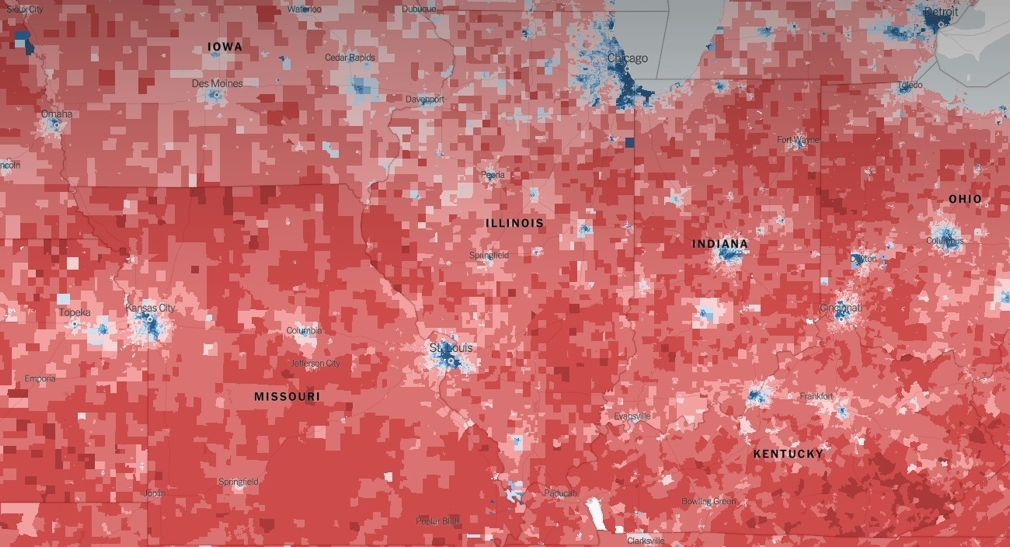
These pictures are as provocative as they are pretty. What is it about population density that is so strongly predictive of policy preferences and political identity? One naturally begins to speculate on the differences in perspective and priorities that come from interacting frequently with neighbors and being confronted daily with a variety of lifestyles.
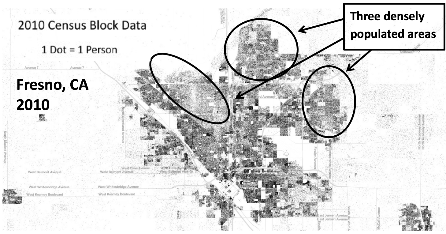
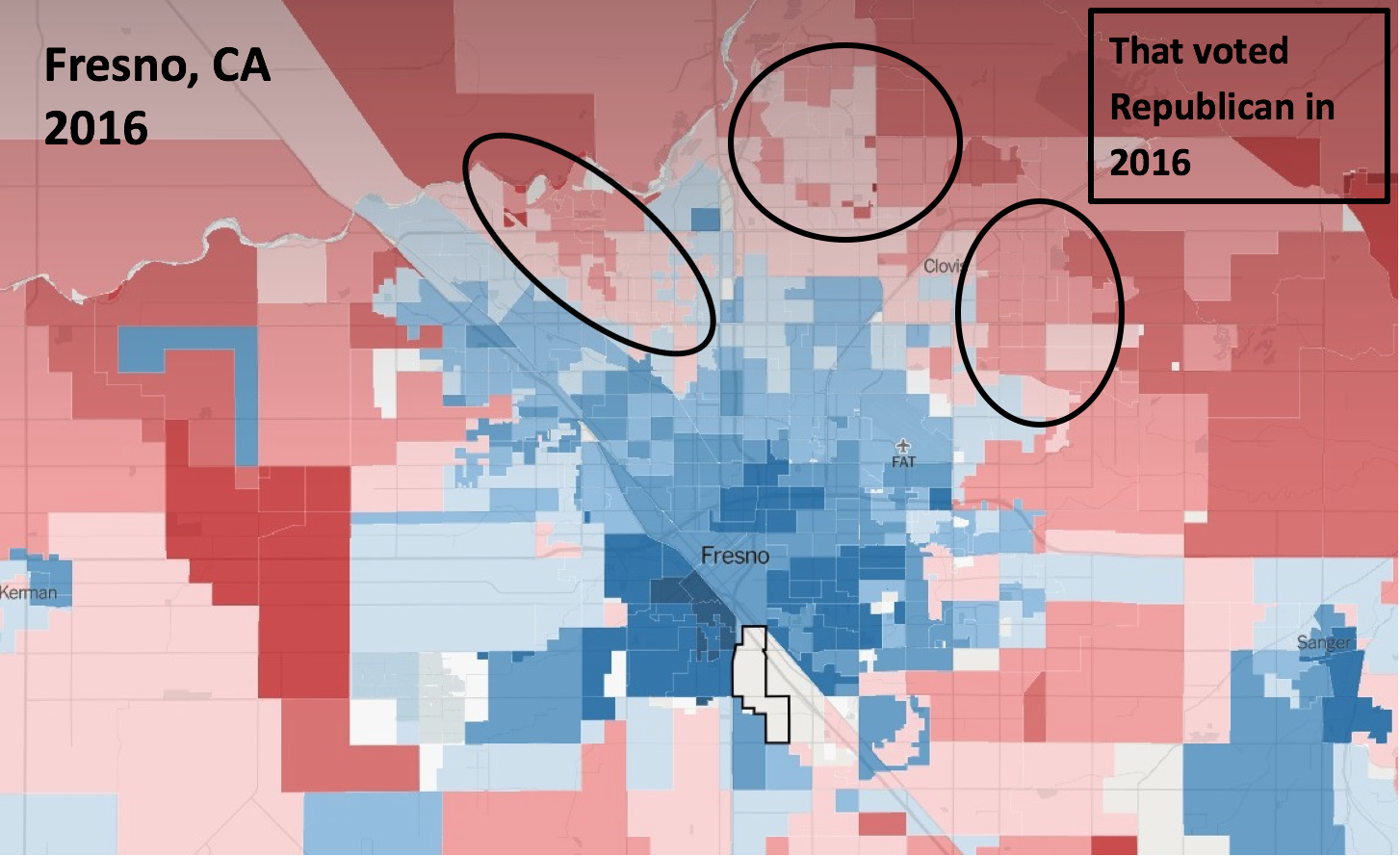
But geography is not destiny, not the sole consistent influence on a voter’s partisan preference. If you look a little more closely at cities, you find evidence of significant variation within cities that seems to be explained in significant part by the racial composition of the neighborhood. Bakersfield and Fresno provide clean examples here in California. Using a population density map provided by Dustin Cable of the University of Virginia and Ryne Rohla’s partisan vote map, a close examination of the Fresno area makes clear that there are segments of town in that are densely populated yet supported Trump. While they are not quite as densely populated as the very center of the city, these areas are clearly part of the city rather than the countryside.
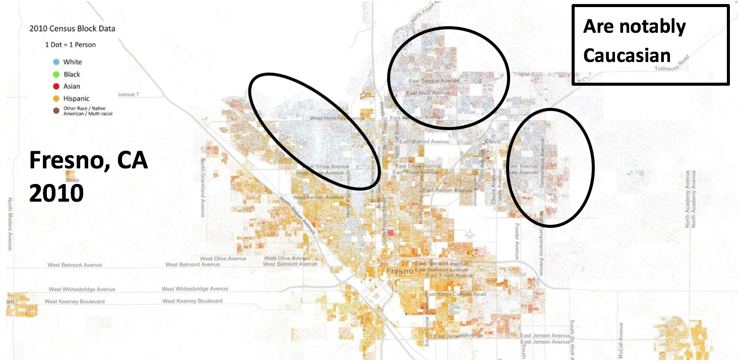
Dustin Cable’s population density map can also be color-coded to indicate the race of each resident. This racial color-coding makes clear that one difference between high-density Trump and high-density Clinton areas is the racial makeup. The former are white, the latter Hispanic. Yes, the Caucasian parts of town may be somewhat less densely populated than the Hispanic parts of town because of higher levels of wealth and commensurate zoning. And Rodden does note that propensity to vote Democratic declines as one goes from the urban core through the suburbs. But the density and proximity of these places to the urban core complicates a simplistic picture of density as destiny. These are all city dwellers who live in close proximity to others.
Bakersfield provides a particularly stark example because the Kern River serves as a clean dividing line. Compare the Caucasian neighborhood of Seguro (the ellipse) with its Hispanic counterpart south of the river, East Bakersfield (the rectangle).
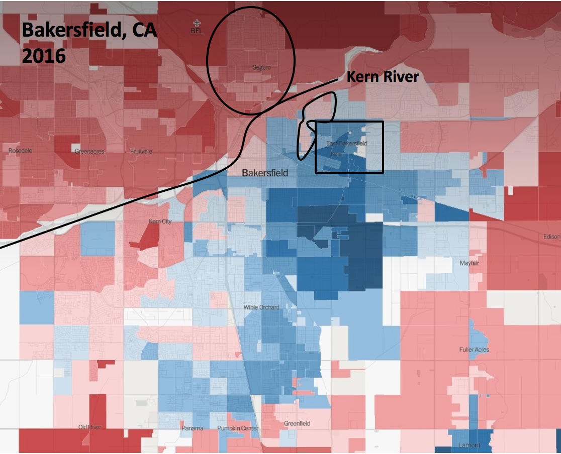
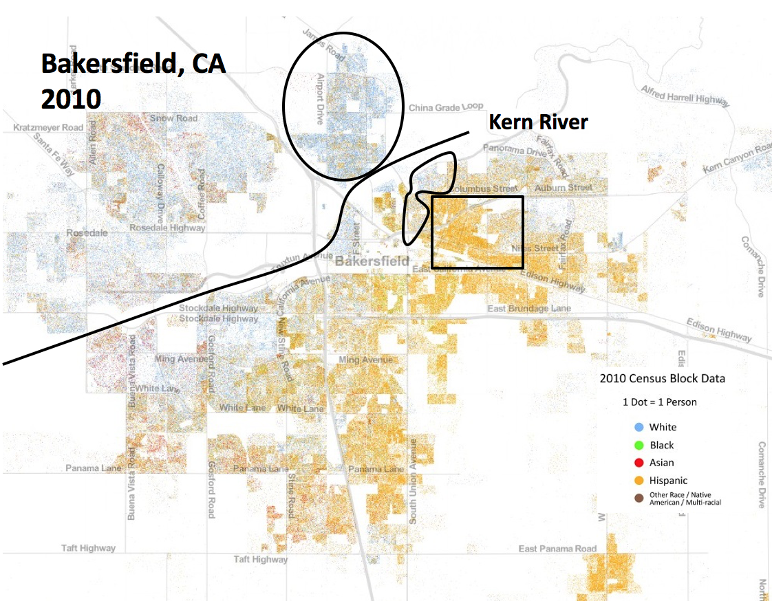
But the correlation is apparent even at finer levels of geographic disaggregation. For example, the vaguely peanut-shaped outline encloses two neighborhoods that are more Caucasian than the surrounding Hispanic neighborhoods. They are also politically pink in 2016 while their neighbors are politically blue.
Is this true outside of California?
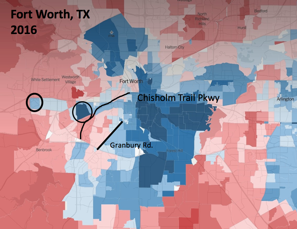
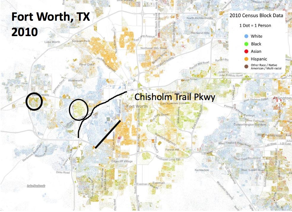
Fort Worth, TX provides a clean example of the same phenomenon. The two circled precincts on the Western edge between Benbrook and White Settlement are the sole ethnically black neighborhoods of the western suburbs. The slice between the Chisholm Trail Parkway and Granbury Road is ethnically white and politically red. Proceeding counterclockwise, the next radial slice beyond Granbury Rd. is clearly more ethnically Hispanic and more politically blue.
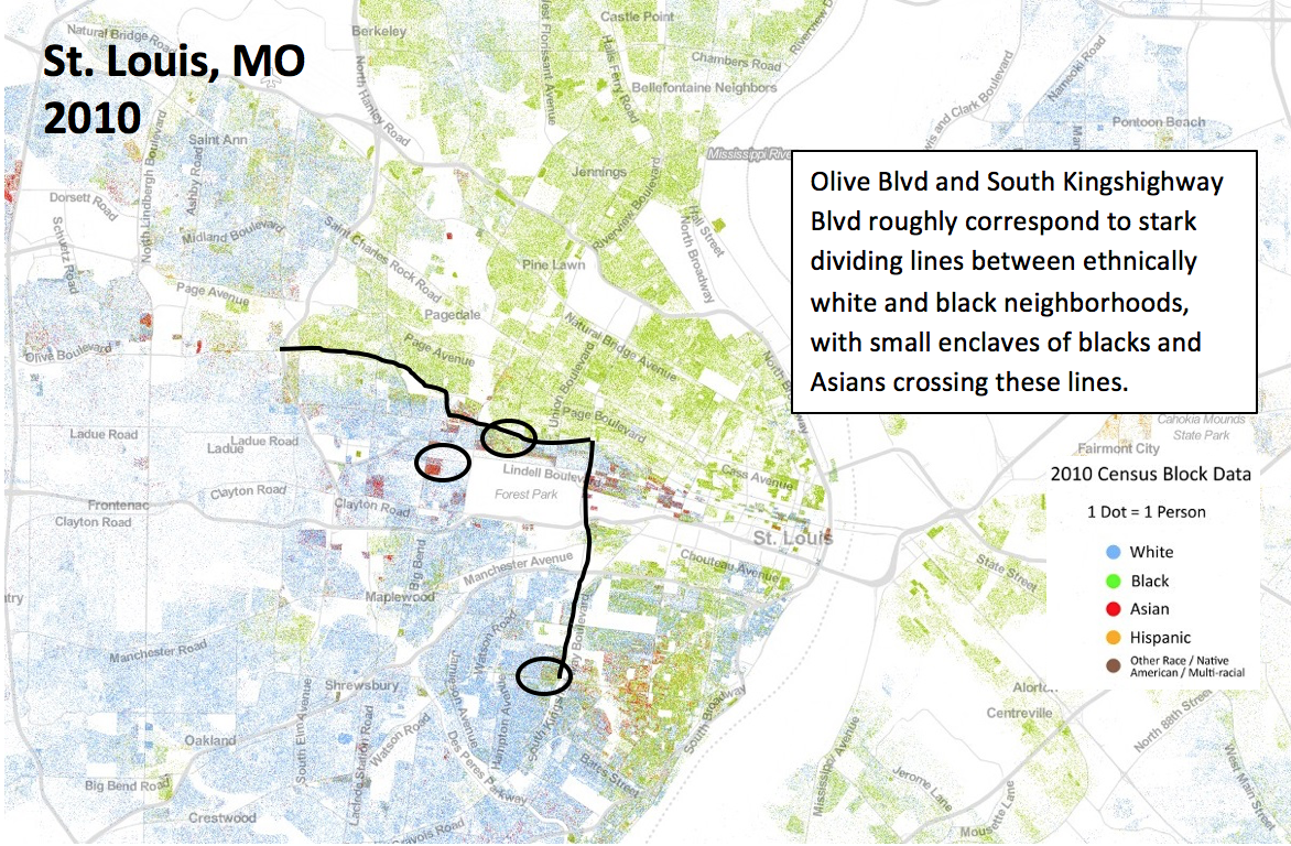
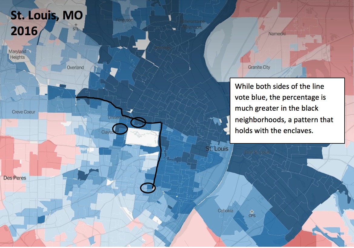
St Louis provides a further example, this time with a different racial minority. There is a stark dividing line running east-west just north of Forest Park. Ethnically black to the north, white to the south. There is a similar line running south from the eastern edge of the park: black to the east, white to the west. While both sides are shades of democratic blue, the shades are darker blue to the north and east, lighter blue to the south and west. Those few black and Asian enclaves that cross the line (circled on the map) are also dark blue. Again, these are all people living in central St Louis; this is not a divide of city and country.
Is this alignment newfound for 2016, a product of Trump’s naked appeal to white nationalism?
Jonathan Rodden has painstakingly compiled and kindly shared precinct level data for elections to national office (President, Senate) from 2004-2008. These data are not quite as finely detailed as those put together by Ryne Rohla for the NY Times. On the other hand, they are available for our statistical analysis below. From these data we can calculate something called the normal democratic vote, which is akin to the share of the vote we would expect the Democratic candidate to receive in an average year.
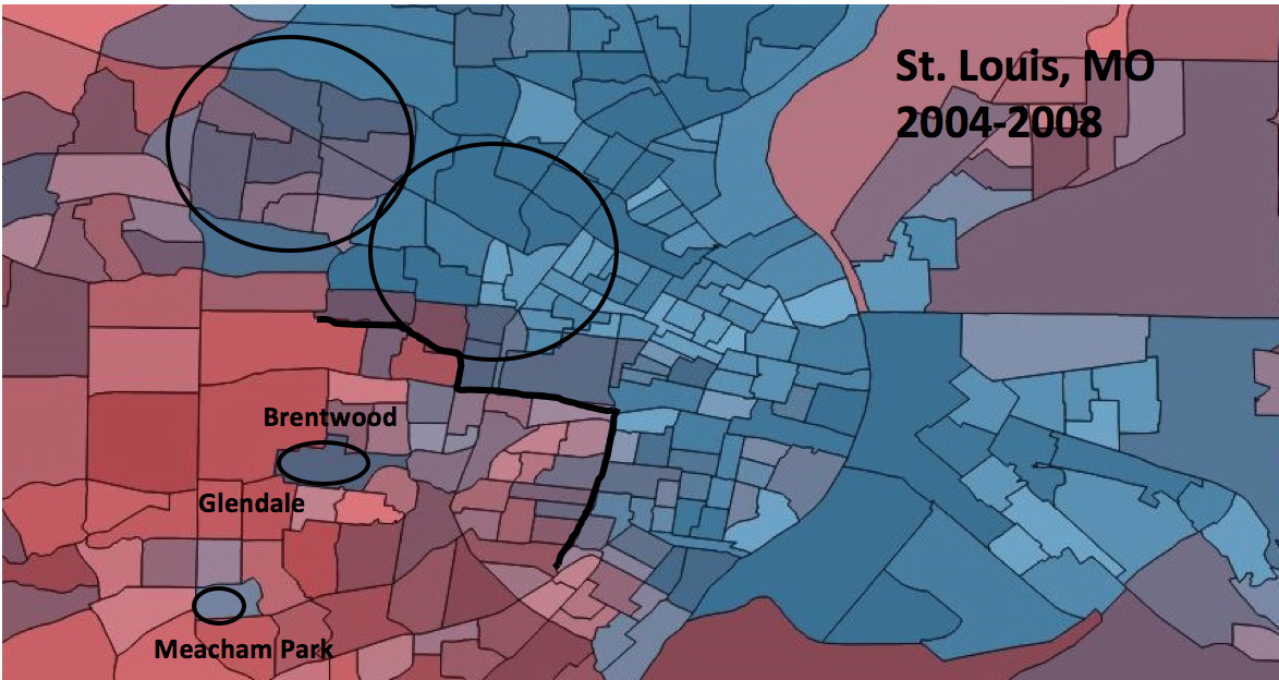
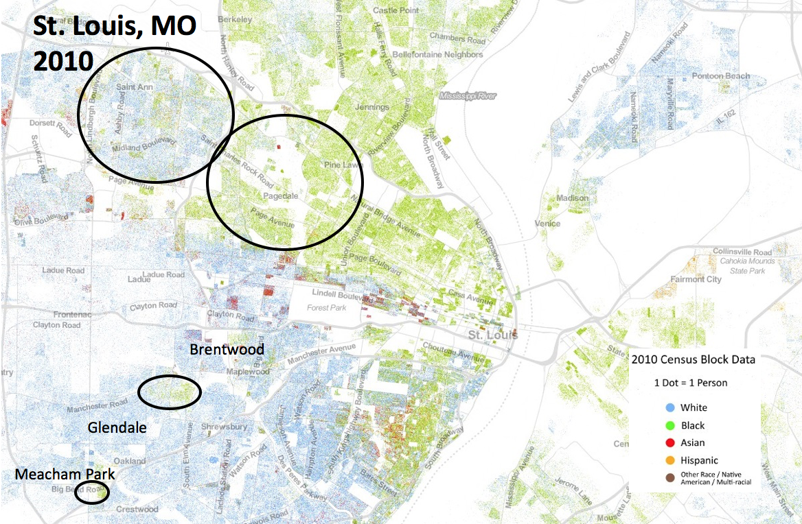
One’s sense of St Louis is that race was already strongly predictive a decade before Trump. The clusters of green dots (black residents) to the southwest of the city center correspond with politically blue precincts in the 2004-2008 data. For instance, where I-44 meets US-61 is called Meacham Park. In contrast to the surrounding neighborhoods, it is both heavily African American and heavily Democratic in 2016. It seems to be strongly Democratic in 2004-2008 as well. The area a bit Northeast, between Brentwood and Glendale, is another African American island that is heavily democratic in both 2018 and 2004-2008. Looking for areas that are dense and Republican, we can compare the downtown areas of St Louis with the I-70 suburbs from St Charles to O’Fallon which are reasonably dense, but racially white and politically red. One can even look at the small white neighborhood on the river south of Chouteau Ave—it is less solidly Democratic than the surrounding black neighborhoods.
These data from 2004-2008 obviously include pre-Obama elections but also contain the unusually high turnout among African-Americans energized by Obama’s candidacy in 2008. Let’s come back to our previous examples in Texas and California where non-white voters are mostly Hispanic rather than African American.
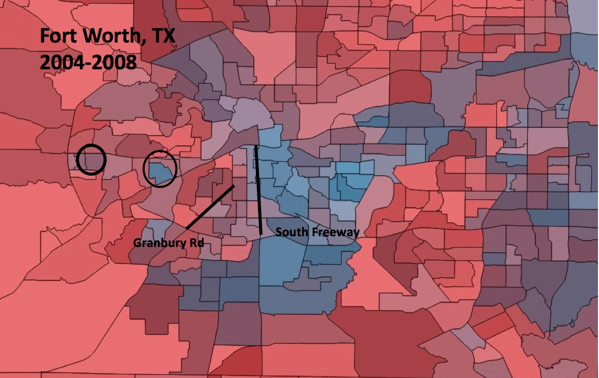
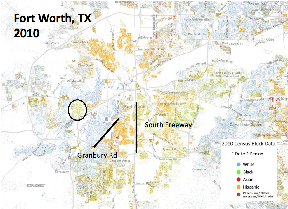
In Fort Worth, the difference between the ethnically black neighborhood just south of Camp Bowie Boulevard and the surrounding ethnically white, politically red neighborhoods is as striking in 2004-2008 as in 2016. But the stark racial divides along 8th avenue/Granbury Road—west of which is white, east of which is Hispanic—do not show up clearly in the 2004-8 data. It is only once one continues further east across the South Freeway and enters the black neighborhoods that one gets reliably Democratic voters. Likewise, crossing south from the Hispanic neighborhood north of Southwest Loop 820 to the white neighborhoods on the southern side seemingly makes little difference politically in 2004-8. However, continue further south to Altamesa Boulevard where the ethnicity once again swings African American and the voting swings reliably blue. Finally, the Hispanic neighborhoods south of FTW airport are also less strongly Democratic in 2004-8 than in 2016. But cross these same boundaries in 2016 and what do we find? A big difference between the Hispanic and white neighborhoods with the former pink and the latter sky blue.
Thus we do have a seemingly important difference between 2016 and earlier elections: in the earlier data it is hard to discern the Hispanic/White neighborhood lines in the political maps. It would seem that Texas Hispanics voted more strongly Democratic in the Trump election than they did a decade earlier. Is that also true of California Hispanics?
Santa Fe Avenue in Fresno marks a clear boundary between the white neighborhoods northeast of it and the Hispanic neighborhoods to the southwest. The political delineation is clear in both 2004-2008 and 2016 and does not seem to have deepened. The areas northeast of Cal State Fresno are both Caucasian and dense and the difference between them and the equally dense Hispanic areas to the South does not seem to have deepened in this California city. We are left with a mixed conclusion. Perhaps California Hispanics turned Democratic earlier than their Texas counterparts?
So we have evidence from a few cities that racial composition of neighborhoods was strongly correlated with the partisan vote choice of those neighborhoods pre-Trump. We also have mixed evidence that the 2016 election may have deepened these divisions.
The sharp-eyed will have noted that the Caucasian neighborhoods of these example cities tend to be less densely populated than the black and Hispanic neighborhoods. The statistically minded will be asking for a multiple regression to sort out whether it is the population density or the ethnicity that is driving the results. The properly skeptical will wonder whether we have cherry-picked just the cities that support our hypothesis. (In fact, these were the first four cities we looked at.) For all of these reasons, we have also run a statistical analysis to which we now turn.
It has long been known that both race and place matter in American partisan politics. But the strong correlation of density and race complicates the disentangling of the relative contributions. Most prior statistical work has been conducted at the county level, which aggregates so much as to obscure the differences between neighborhoods that our closer look at the maps above shows to be critical. Rather than comparing East Bakersfield to Seguro, one ends up comparing Los Angeles county to Shasta county. Results are then driven by whether a county contains a sizable city or not. Much of the important variation—such as the difference between white, urban voters and their Hispanic neighbors—is lost. Precincts of a few thousand voters are clearly an improvement on counties with tens or hundreds of thousands which frequently lump both urban and rural areas together. By analyzing at the level of the precinct, we can see that even among those who live in cities, white neighborhoods are more likely to vote Republican and minority neighborhoods are more likely to vote Democrat.
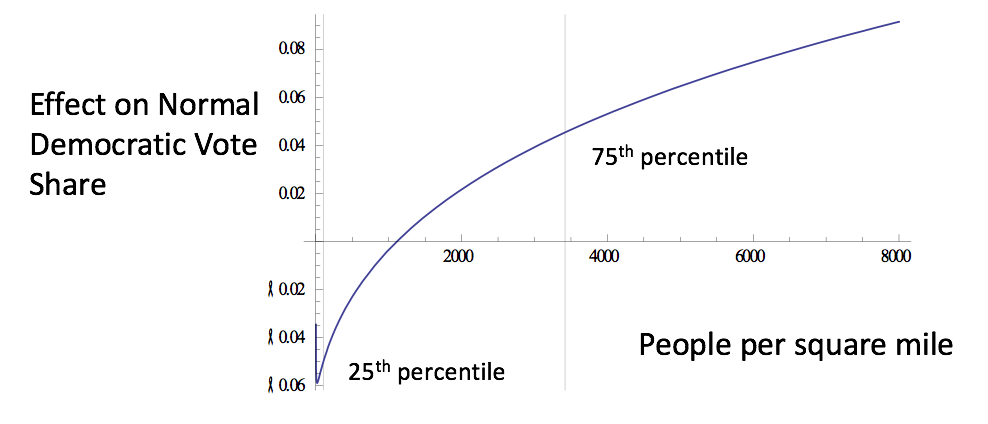
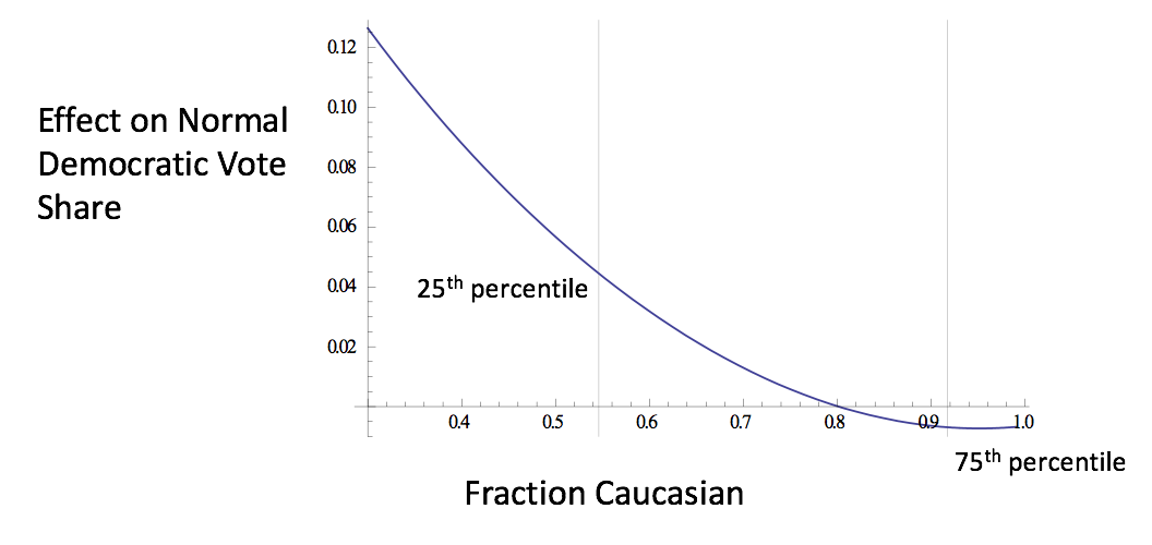
We are trying to explain the normal Democratic vote share in elections to national office between 2004 and 2008. Using log of population density and fraction of the precinct which is Caucasian as our explanatory variables, we ran a fractional polynomial regression. This method is designed to allow for complex functional forms. From the results, we generate the effect of changing one of these variables while controlling for the effect of the other. From the graphs you can see that as the population density increases, the precinct becomes more Democratic. In counterpoint, as a precinct becomes whiter, it becomes less Democratic. Because we have controlled for population density, this is the partial effect of race alone.
So they both matter. But which one matters more? To compare the size of the effects of population density and race, we have placed vertical lines at the 25th and 75th percentiles. For example, the precinct at the 25th percentile of population density has 101 people per square mile while the precinct at the 75th percentile has 3419 people per square mile. We then calculate the effect on the democratic vote share of moving from the 25th to the 75th percentile for population density, and similarly for fraction Caucasian. This interquartile difference is 9.6% for population density. E.g. if the less dense district were split 50-50 Democrat-Republican, the more dense district would be 59.6 to 40.4 in favor of the Democrats. Clearly, as argued by Rodden, Troy, Kolko, and others, the effects of population density are large even after we control for race.
What our analysis shows is that the effects of ethnicity, while smaller, are also large. The interquartile difference for race is 5.1%. Moving from the 25th percentile (55% white) to the 75th percentile (92% white) lowers the Democratic vote share by 5.1%. Keep in mind that these are for voting data from 2004-2008, long before the Trump election which, according to our maps above and other careful analysis, seems to have heightened the racial dimension of partisan politics.
We should be cautious about overselling these results to suggest that voters are simplistic expressions of their race and place. Using the Cooperative Congressional Election Study in which respondents are asked to divulge their vote choice in the most recent election along with a long list of demographic variables including race, zip code, household income, age, marital status, military service, religious attendance, home ownership, union membership, and others, we estimated how much of voters’ choices could be explained by their demographic characteristics. The answer was a mere 20%. (The higher R-squared frequently seen in vote choice regressions are generated by the inclusion of partisan affiliation as an explanatory variable which relegates demographics to explaining why one has deviated from one’s preferred party, an entirely different question.) Our demographic identities influence what we experience and the appeal of the parties, but the overwhelming majority of our partisan choices are based on other factors such as our life experiences and our visions of a just society, neither of which can be encapsulated by a census questionnaire.
Nonetheless, these results show that place and race are consistent influences at the margin. In a large population, many will, by dint of their experiences, naturally be open to either party but the experience of living as a white citizen will tip some towards the Republicans, while living as a Hispanic citizen tips another otherwise similar voter toward the Democrats. While political sorting is increasingly matching geographic sorting, race remained important in determining political behavior even prior to President Trump’s explicit platform of white nationalism. It will likely remain so long after he is gone.